We are really excited to launch the new Magnifica brand and website. It has taken a gargantuan effort over the past 4 months to bring everything together. However all that hard work has paid off and we're really proud to present to the world a striking new brand and web experience.
So why rebrand?
When Magnifica started back in 2013 Rob Gregory put his somewhat limited graphic design skills to work on developing a logo for his new business. The logo he knocked-up in about 30 mins was only intended for temporary use but ended up sticking around for almost 6 years, a common story for small businesses.
Magnifica is a different business to what it was back in 2013 and the world looks pretty different as well - time for an update!
So, towards the end of 2018 we decided it was time to rebrand the business in preparation for our 2019 growth plans. The goal of the rebranding exercise was to freshen things up but also to position Magnifica as the creative and forward thinking digital agency our customers know us to be.
We estimate it's taken 368 coffees (and a few beers) coupled with lots of hard work on design, development, content creation and testing to launch our new brand and website.
Below we describe the process in full.
Brand development process
To reimagine the Magnifica brand we worked with branding and design agency Design kabin in Chesterfield. We cannot recommend them highly enough - great process, super creative and fun to work with as well.
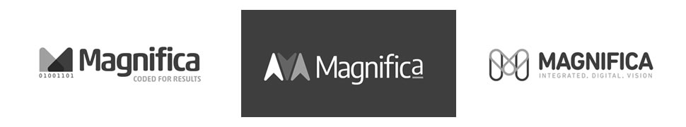
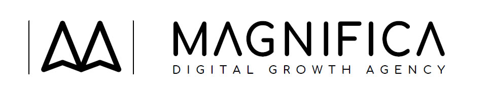
1. The old logo
The original Magnifica logo was pretty basic and not thought through in any great detail as all (Rob isn't a designer). Basically, Rob chose a colour and a font then stuck them together. He was pleased with his logo and quickly moved on to other startup activities.
The only real design choice made was to drop the capital M. The font used is called Comfortaa by designer Johan Aakerlund.
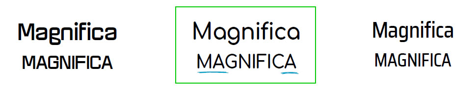
2. Initial design concepts
Desgin Kabin worked up 3 initial design concepts. These sparked lots of conversation but we decided to progress the second concept as we liked the idea of the mouse pointer shape being incorporated into the brand.
After deciding on a direction based on the initial concepts the next step for the designers was to go back to basics and look into fonts.
3. Type
Our logo was going to be mainly text based so it was really important to get this right. Design kabin looked at a number of options.
Without realising it the font the designers selected was in fact Comfortaa. A happy coincidence they selected the same font as our old logo….we like the nod backwards to our roots.
4. Arrow usage
Design Kabin chose the font for the shape of the capital A as they saw the potential to use this in carrying forward the arrow / mouse pointer concept we liked from initial concept number 2.
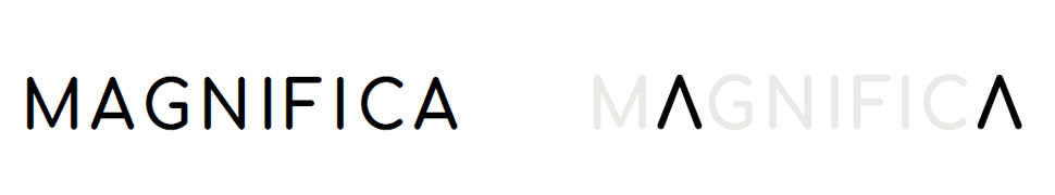
5. Arrow mark
Seeing the potential in the shape of the "A" in the Comfortaa font further enhancements and design work were carried out. Eventually the form of the A was used to represent the mouse pointer.
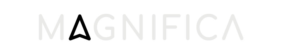
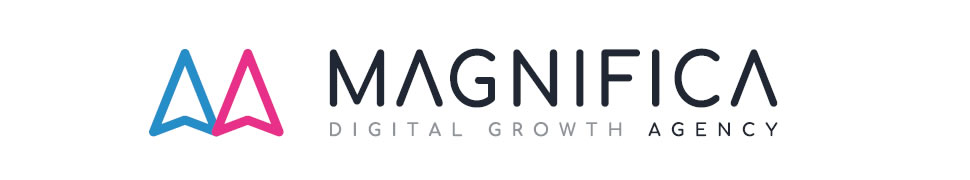
6. Logo in full
Lifiting the 2 A's out of the Magnifica word and combining them to make a logo mark was the next step. Overlapping the 2 cursor shapes gives an impression of the letter M. It's starting to come together.
At this stage we were getting really close to the finished brand but requested further simplification and also gave direction on the colours we wanted to incorporate.
7. Changes and colour
By removing the two vertical bars the logo became super simple and adding the vibrant blue and pink brand colours made the whole design come to life.
8. Finalisation
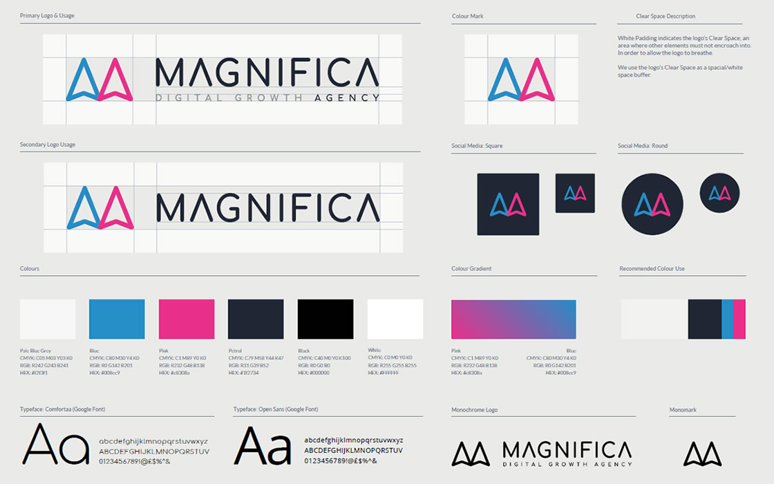
With the logo font, arrow mark, byline, colours and spacing all agreed Design kabin set about finalising our new brand style guide. With this delivered along with exports of all assets in every format under the sun we were set to start rolling out or striking new branding across the business.
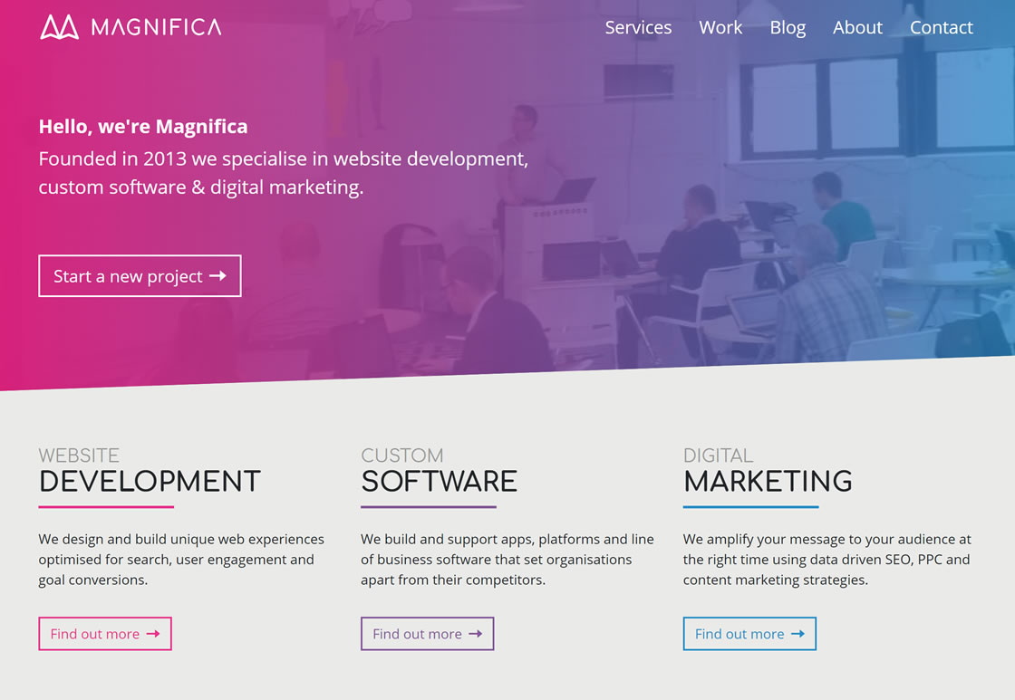
A New Website
With the new brand complete it was time to look at the rest of our marketing assets, starting with our website. Just like the branding our old website had been around since our beginnings in 2013. It was mobile responsive and it actually still performed pretty well for us but it was starting to look dated and needed supercharging ready for our growth objectives.
So here is our new website. A place to showcase our work, promote our services and through this blog provide advice and tips on website development, custom software and digital marketing.
Feedback please
We tell our customers that their website is never finished and that in fact we see a website as series of digital experiments each providing results that inform the next experiment. By performing well planned experiments and tracking the results we are able to continually optimise the websites we build.
So in the spirit of practising what we preach our new website isn't finished and we are running experiments to make it better right now. We'd love to hear your feedback good or bad. If you spot an issue or something could work better just let us know.